Accessible Door Switches for Enhanced Usability
I’ve always appreciated the idea behind double-entry doors—using an airlock to keep warm or cool air inside while saving energy. But one day, as I watched people entering a building with this design, I noticed something surprising. Many seemed unsure about which door to open and often ended up opening the wrong one. This small moment of confusion not only slowed them down but also defeated the purpose of the airlock, allowing air to escape. It made me realize that while the concept is clever, its effectiveness relies on clear usability, which this design seemed to lack.
Identifying the Problem
At TSRB at Georgia Tech, I noticed a curious setup in the double-door entryway. There are two nearly identical switches, each controlling only one of the doors. This design often leaves people confused, unsure of which switch to use. The lack of clarity not only causes delays but also diminishes the overall user experience, highlighting a need for a more intuitive solution.

Observing Behaviors
As I continued observing the double-door entry at TSRB, it became clear that these switches weren’t just for individuals with disabilities. People carrying packages in one hand or both hands often relied on them for convenience. However, a recurring issue stood out—many struggled to identify which switch operated which door. This confusion led to hesitation, wasted effort, and even moments of frustration, especially when they needed to open both doors. The design, while functional, lacked the clarity necessary to seamlessly serve everyone using it.
Developing the Solution
Cost-Effective Method - I explored various materials and methods, including 3D printing and laser cutting, to address the issue with a focus on cost and efficiency. Ultimately, I developed a solution costing just $1 and taking less than five minutes to create.
Usability - While I couldn’t conduct a full-scale usability study, informal interviews with a few users revealed that they could instinctively understand the mapping between switches and doors. Additionally, the design provides tactile feedback, making it more accessible for visually impaired users by guiding them through touch.


Presentation in the Design Contest
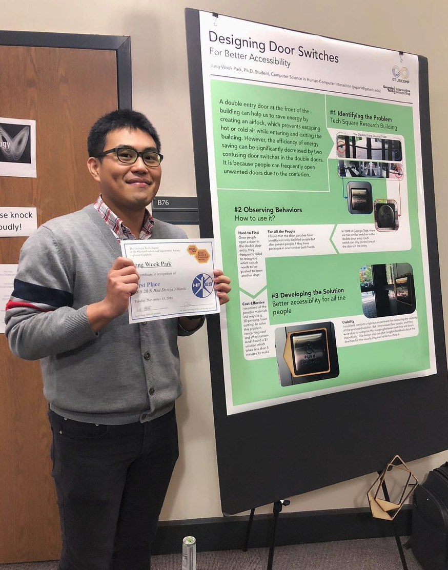
The journey from identifying a problem to creating a solution came full circle when my design was awarded First Place in the HFES Bad Design Poster Contest at Georgia Tech. The recognition wasn’t just a personal milestone—it was a testament to the power of user-centered design to address everyday challenges.
What started as an observation of confusion at a double-door entry evolved into a practical, cost-effective fix that resonated with both judges and users. The design not only solved the immediate issue but also highlighted how even small changes can make a big difference in accessibility and usability. Winning this contest reinforced my belief that thoughtful design has the potential to transform common inconveniences into opportunities for improvement.


